Hey Everyone!
John here, with my first blog entry for the show. This week we talked all about oil and energy and although we did cover a lot of ground, there was still a lot of stuff I wish we could have covered. Unfortunately, we ended up going way over our goal of an hour and we just had to cut some stuff out. By the way, what do you guys think? Should we stick with an hour, move up to an hour and a half, or maybe drop the length down a bit?
Anyway, here's some of the other cool facts I wanted to mention but we never got a chance to cover. First of all, this first link is to the website where I quoted you the yearly averages of a barrel of oil in the Illinois basin. It covers a lot of time so you guys can check out what oil's been doing since you've been alive. Here it is. Secondly, if you want to know all the U.S. oil statistics and see them presented in a way that's not too confusing, I'd recommend the government's official site. A lot of my data comes from there.
So check it out. I just wanted you guys to see how the market gets affected by China in particular. I have to say though that when I first heard the arguement about China's demand being the cause for my gas prices, it sounded like a cop out. But take a look. The red line is of world oil prices since 1947:
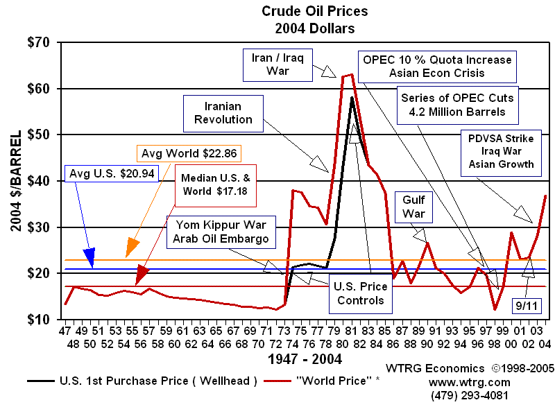 Do you see how right around 2002-2004 something invisible happens and all of a sudden the price explodes? So what happened? Take a look at China's oil import history:

Ridiculous, huh? Look how it starts to spike between 02 and 04. That spike corresponds perfectly with what oil prices have done. But what about the oil supply, right? Haven't the oil producers kept up with demand? Well, look at these 2 charts. The red line on the first one is U.S. oil consumption. Notice you can still see that spike in prices (black line). Our consumption has steadily risen since 1983.

Now look at another chart of OPEC Oil Production. I don't want to take up too much space but there's another chart I have for Non-OPEC countries that is almost exactly the same.
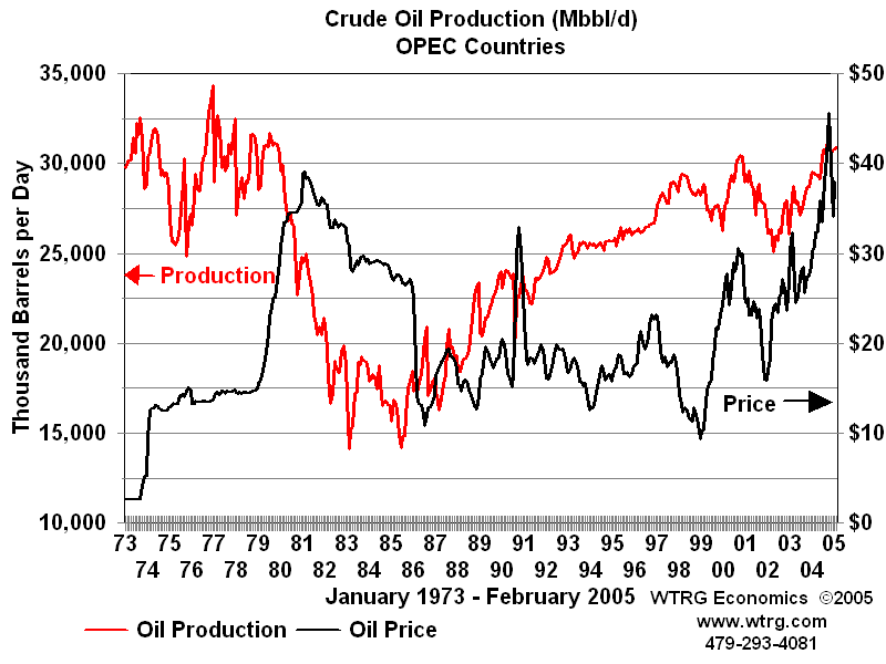
So there you can see it for yourself and if these graphs are accurate, the logic is hard to refute. Since about 1983, oil producing countries have raised production roughly as steadily as U.S. demand grew. On both of these charts you can see that crazy price spike that began a few years ago. You'll notice that oil production did not decrease in harmony with that spike, so that can't be the cause. It's basic economics, if supply and price are both going up, demand must be skyrocketing. Where? Well, go back to the graph of China's imports and when they began to spike and you have your answer. I don't see any way around it. I don't have the particular info for India with me but you can see it enough when it comes to China. World demand is increasing faster than supply. Thus, higher prices. Conspiracy theorists, I'm sorry.
For those of you who are interested in just where our oil comes from, here's an estimate of how much oil per day comes from various places. Of course, we regularly import oil from something like 40 different countries but here are some of the big ones:
The total U.S. imports for barrels of oil per day in April was 9,921,000 barrels. From OPEC countries we got 5,660,000 and from non-OPEC countries we got 4,261,000. Saudi Arabia gave us 1,453,000 barrels while Canada gave us 1,952,000 at roughly the same price. We also import more oil per day from Mexico than we do from Nigeria. The U.S. has a very diversified oil import system so if Saudi Arabia is just out to get us, so is Canada.
I recommend we all do our research on peak oil. It's been consistently right in the past and the prediction is that we're hitting the peak right about now. If so, this is just the tip of the iceberg and it's time to GET OFF OIL though whether or not you think we should drill domestically meanwhile to offset the price is another matter.

 Weighing in from a public relations standpoint, I think this was a genius idea from Disney. It's very fun and easy to share and it strokes our egos -- the main ingredients of a successful viral video campaign. Not only that, but even though the video content is customized, the quality is incredible. Goofy even said my name smoothly in the middle of a sentence. Impressive to say the least. The idea, of course, is that you matter to Disney. No matter who you are, when you go to Disney, you'll get celebrity status. My bet is that this campaign will be a huge success. I've already sent customized versions to friends, coworkers and family members. I usually just like to send them the Nate Long version though; it makes me feel epic. Well done, Disney.
 By the way, I guess you could say I actually do have some Disney celebrity status because I received my Nate Long customized video from the man I call "The (International) PR Guy" of Disney himself. Thanks, Tony!


 Above: cloned areas used to add a fourth missile to the picture
 Above: major media outlets posted the picture before realizing it was altered


